
Logo and Identity for restaurant
- Jun 4, 2018
- 1 min read
Client:Master Bull Role:Visual Identity, Logo, packaging,
The master bull Co. is a new-BBQ, fast food and bar place in New Jersey. The Logo, designed in 2018, revolves around a master bull. The founder of the brand is a Chinese,food and beverage investment enthusiast. His surname Niu in Chinese characters is also the homonym of the bull. Therefore, using a strong bull and holding chopsticks as an icon, the friendly and lovely figure makes a foundation that the brand's online promotional material.

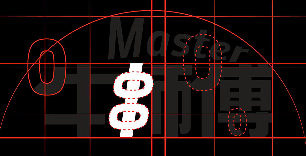
In the design of Chinese characters of the logo, the sans serif font was used at first, but in the end, it was decorated with the overall shape of the BBQ.


When passers-by see the icon, even if they don't recognize Chinese, they can also identify the restaurant's main dishes.

The first version of the cartoon image design

The second edition is compared to the first edition.
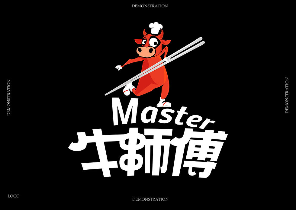
In the final logo version, the fork was replaced with chopsticks, because most of the restaurant's main dishes are Chinese style, so the chopsticks are more in line with the restaurant category.


Comments